
MHPOOLE.DESIGN STUDIO / PROJECT RABBIT HOLE

03 / SELECTED COMMERCIAL WORK / FRENCH CREATIVE GROUP ERA

MOTION / BRAND / CONCEPT

PROGRESSIVE
BANK.

Original Progressive Bank emblem from the broadcast commercials

THE ART OF MAKING
THE INTANGIBLE VISIBLE.

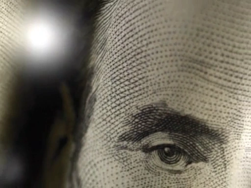
Close-up of engraved currency portrait from Cash Management commercial
THE CURRENCY / SPOT 01
Gold metallic surface from Trust and Wealth Management commercial
THE GOLD / SPOT 02

ART DIRECTION / BROADCAST ADVERTISING
CONCEPT & VISUAL DEVELOPMENT

WATCH THE WORK ↘
01 / THE ASSIGNMENT ADVERTISING / BANKING / BROADCAST

NOT JUST
ANOTHER
BANK AD.

How do you give financial services a visual presence—and hold someone's attention in fifteen seconds?

Progressive Bank's broadcast work used bold black fields, metallic imagery, circular movement and carefully paced typography to express two different services through a shared visual system.

These are finished commercials from Heath Poole's agency-era advertising work, not speculative concepts. This case study focuses on the visual thinking and art direction rather than claiming sole authorship of the production.

And this time, we can show the original working sketch—not just the finished result.

ROLEArt direction
FORMATTwo 15-second broadcast spots
AGENCY CONTEXTFrench Creative Group
STATUSProduced advertising
02 / THE DRAWING BOARD ONE OF THE ORIGINAL CONCEPT SHEETS

THE WORK BEFORE THE WORK / ORIGINAL ARTIFACT

BEFORE
THE SCREEN.

It started on paper.

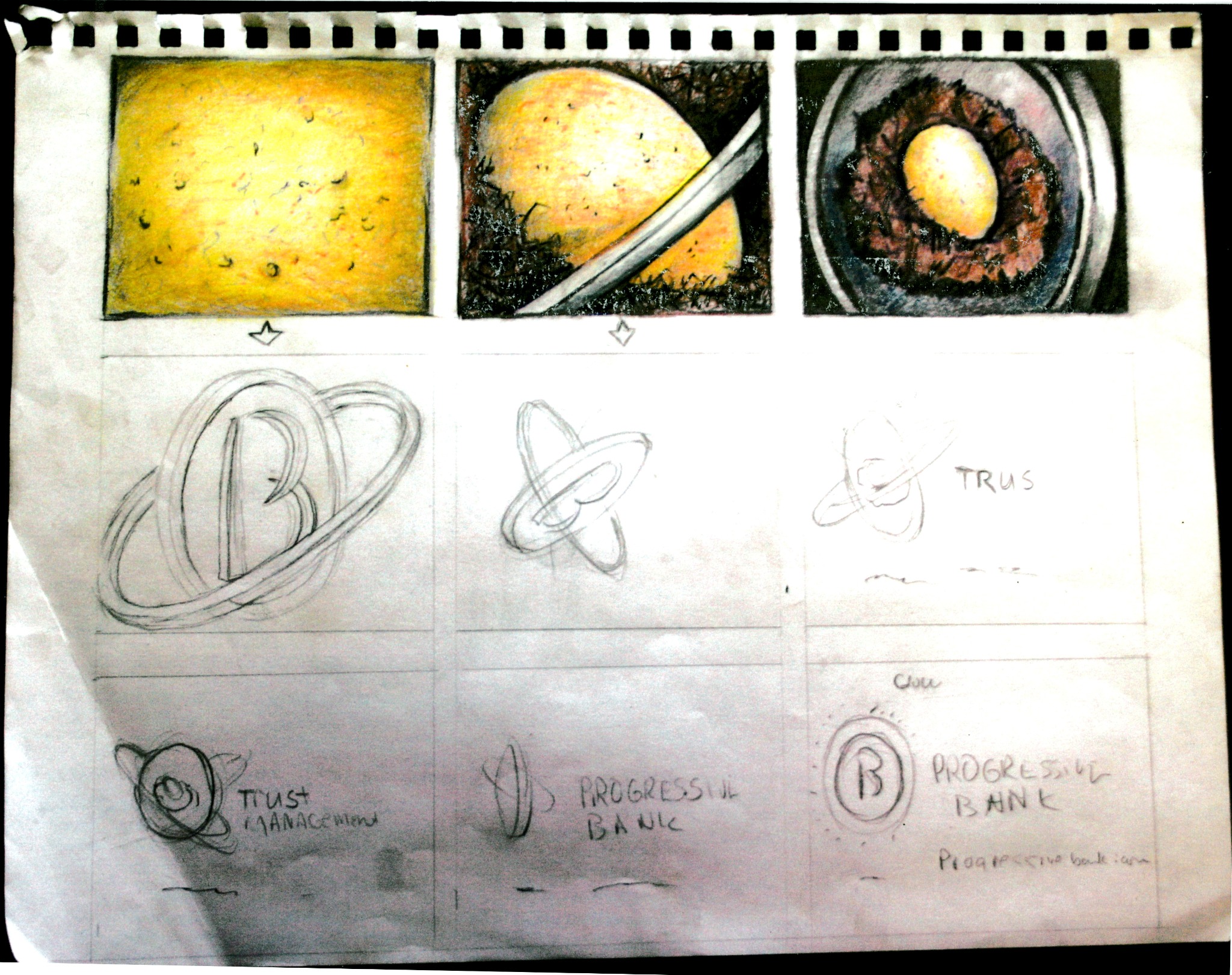
Color studies, loose pencil forms and handwritten notes from the Progressive Bank creative process. The sheet explores the golden-egg imagery and circular brand forms that helped shape the visual direction.

This is the original working artwork, presented as found—not a modern reconstruction. The sketches show a stage in the process, not a frame-for-frame storyboard of the finished films.

NOW WATCH THE FINISHED WORK
Original photographed Progressive Bank concept sheet: three hand-colored gold egg and circular-image frames above pencil drawings of ringed bank symbols and handwritten service notes.
ARCHIVE NO. 01 / ORIGINAL CONCEPT ARTWORKVIEW ORIGINAL PHOTO ↗
01 / COLOR STUDIES02 / PENCIL EXPLORATIONS03 / HANDWRITTEN NOTES→ FINISHED COMMERCIALS BELOW
03 / TWO FILMS PLAY THE ORIGINAL COMMERCIALS ↓

IDEAS
IN MOTION.

Two services. One disciplined identity. These are the actual uploaded spots, presented with their original audio.

PLAYBACK / 01CASH MANAGEMENT / 00:15
01

CASH
MANAGEMENT.

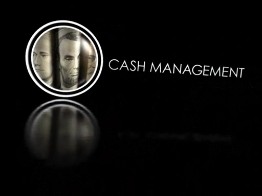
A close study of engraved currency gives way to a polished silver circular motif, typography, and the bank identity.

ENGRAVED PORTRAIT / CHROME / MOVEMENT
PLAYBACK / 02TRUST & WEALTH MANAGEMENT / 00:15
02

TRUST
& WEALTH.

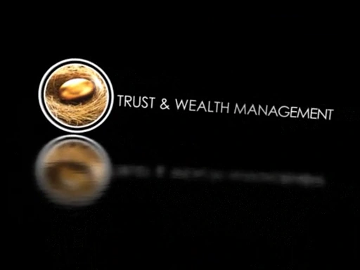
A warmer visual counterpoint: the gold egg in a nest, orbiting rings, and a restrained typographic close.

GOLD / NEST / CIRCULAR VISUAL LANGUAGE
04 / THE VISUAL SYSTEM ONE BRAND / TWO VISUAL METAPHORS

THE IDEA
HAS TO MOVE.

The story isn't only what appears on screen. It's how a few key decisions—material, color, rhythm, framing—give separate products one recognizable visual vocabulary.

Magnified currency portrait engraved in paper
01 / CURRENCY AS TEXTURE
Cash Management service title with silver portrait motif
02 / THE SILVER CIRCLE
Close-up of gold surface used in the Trust and Wealth Management spot
03 / GOLD AS TEXTURE
Trust & Wealth Management service title and golden egg motif
04 / THE GOLD CIRCLE

CONCEPTA single branded motion language can support distinctly different financial messages.

ART DIRECTIONMaterial contrasts—silver and gold, paper and metal—work against a near-black stage.

FINISHCircular emblems, reflection, controlled movement, and a consistent bank sign-off tie the work together.

05 / FROM THE ARCHIVE ORIGINAL WORK / PRESERVED IN MOTION

FIRST
THE IDEA.
THEN THE
SCREEN.

The preserved concept sheet and original production videos give two views of the same creative assignment: rough thinking and polished broadcast. Both are part of the Progressive Bank archive.

The photographed sheet is presented with its original pencil marks and notes intact. More source material may be added as the historical campaign archive is organized.

VIEW ORIGINAL BEHANCE ARCHIVE ↗
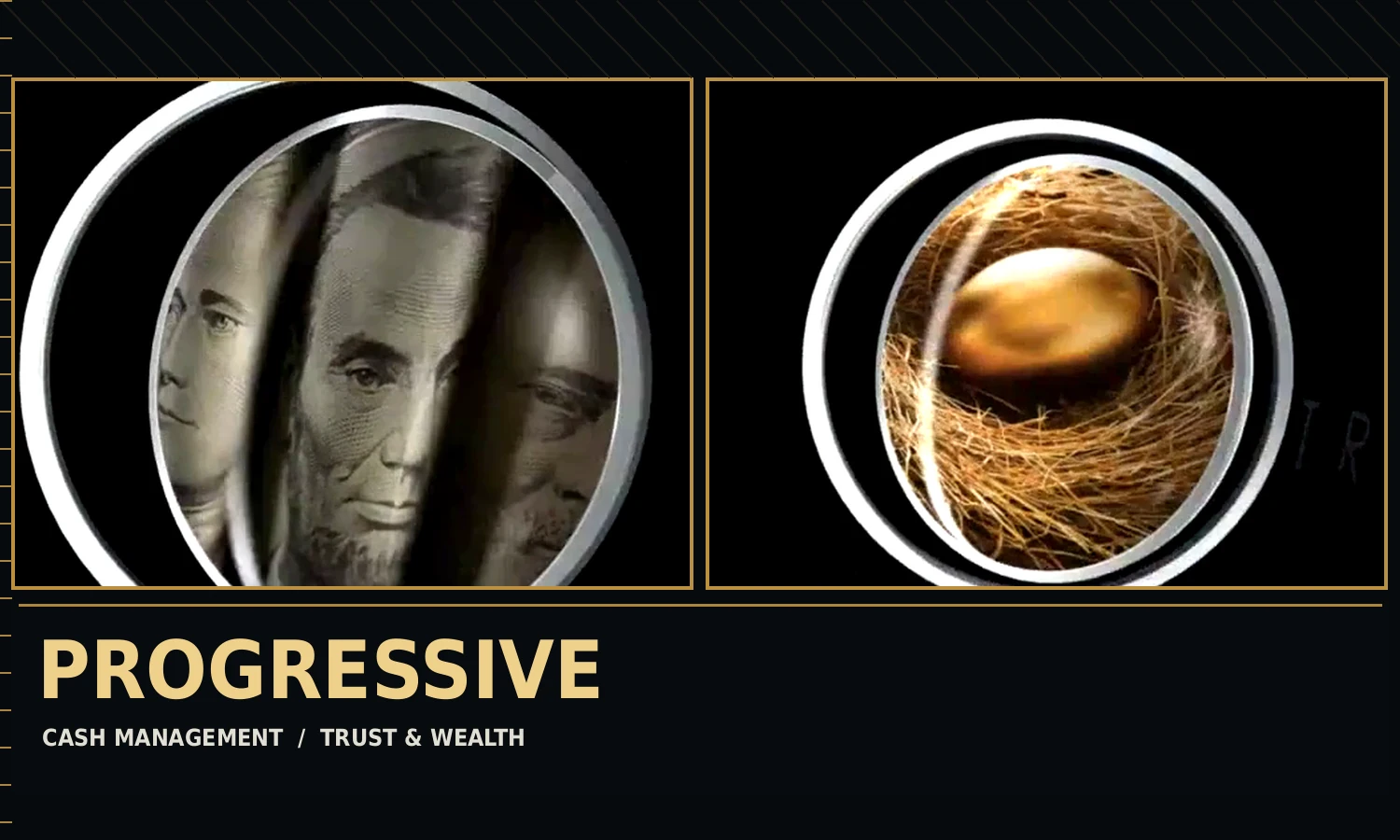
Editorial montage assembled from the two original Progressive Bank commercialsWORK / NOT A MOCKUP
ORIGINAL 15-SECOND SPOTS
06 / END FRAME

AN IDEA
YOU CAN
SEE.

Conceptual thinking, visual control, and the ability to take work from advertising brief to finished broadcast communication—that's the value of the work.

M. HEATH POOLE / ART DIRECTION
CREATED DURING FRENCH CREATIVE GROUP AGENCY WORK
PRODUCTION IS A COLLABORATIVE CREDIT

← BACK TO THE WORKNEXT / CHENNAULT AVIATION ↗